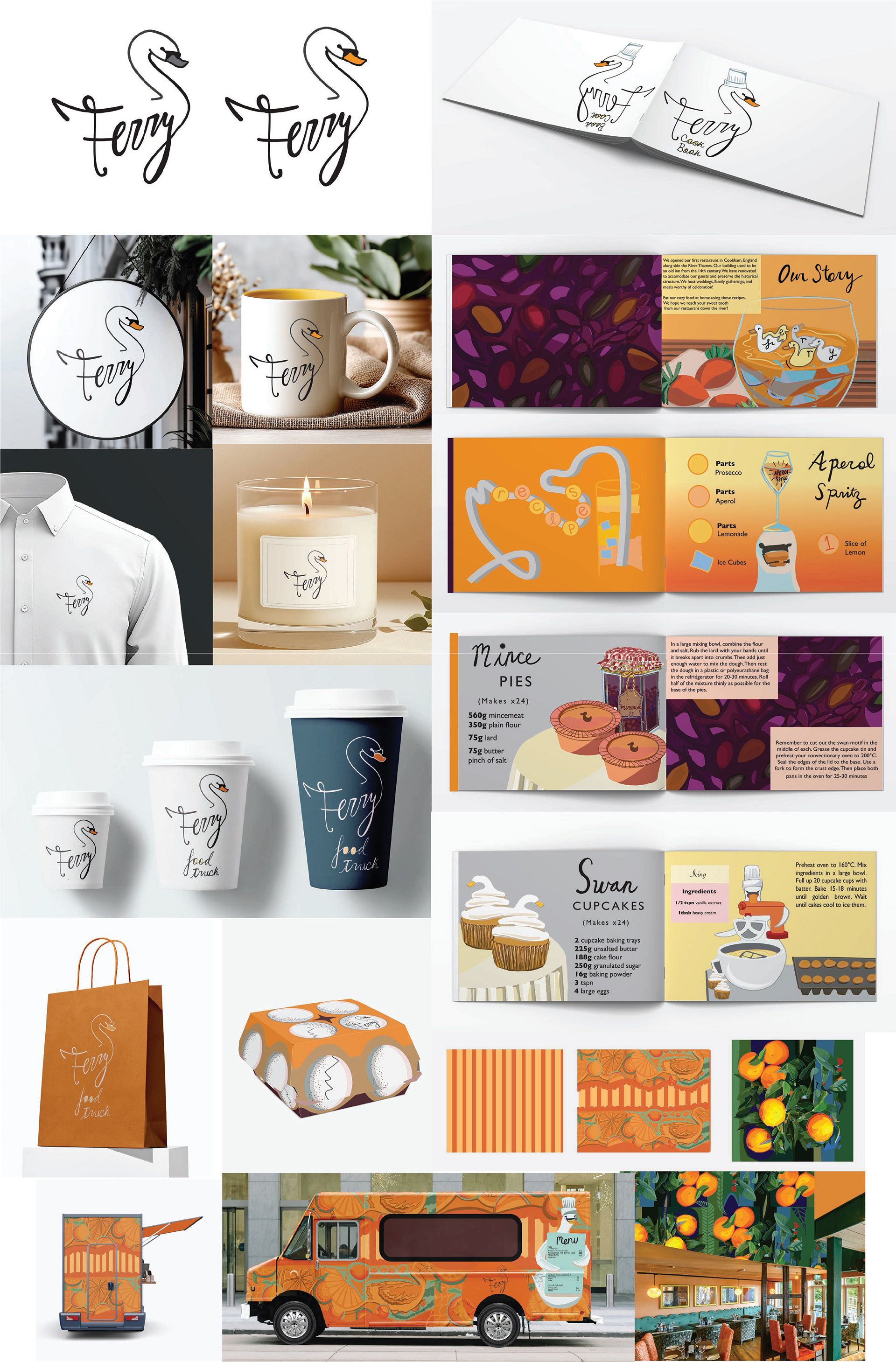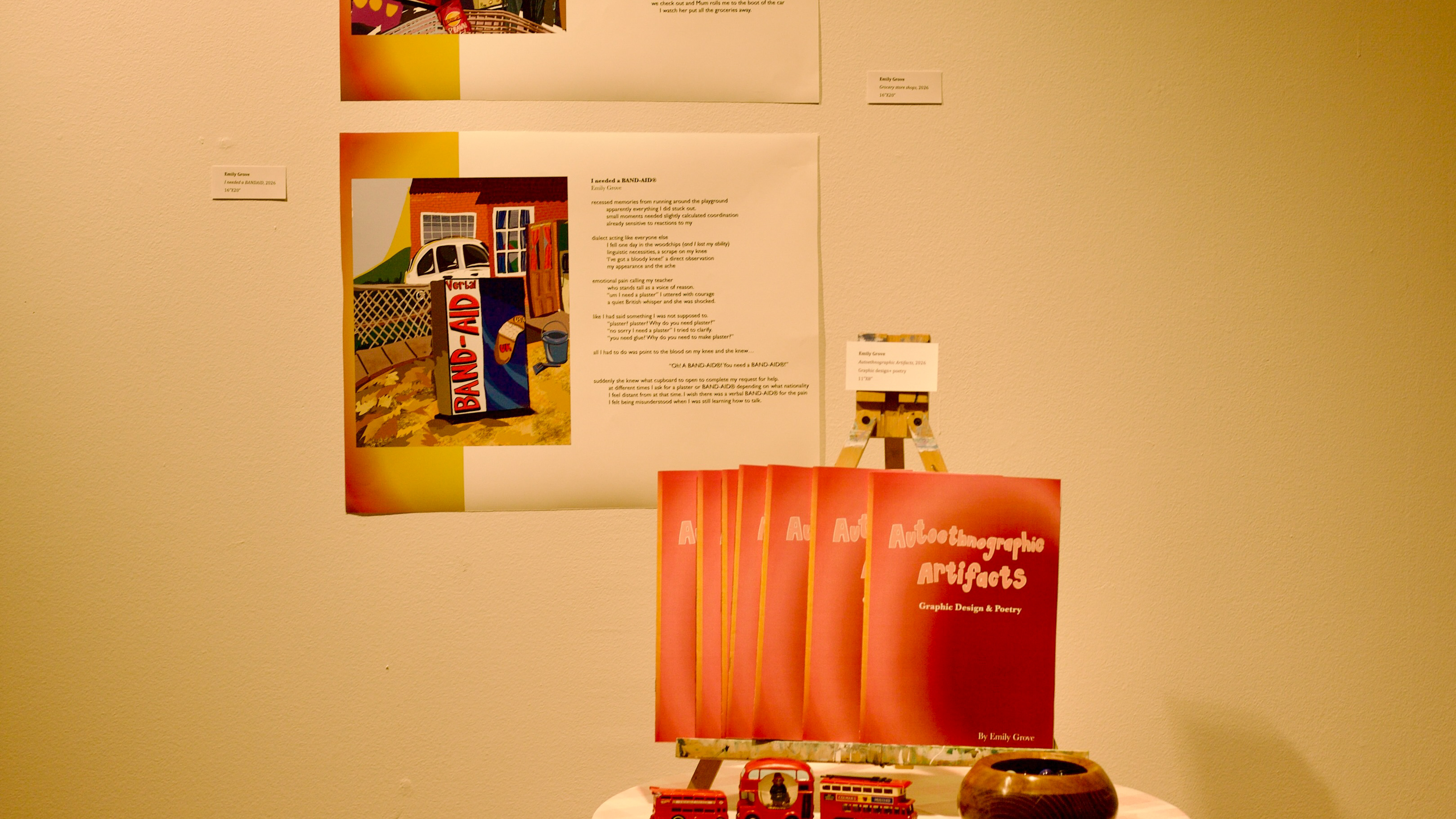
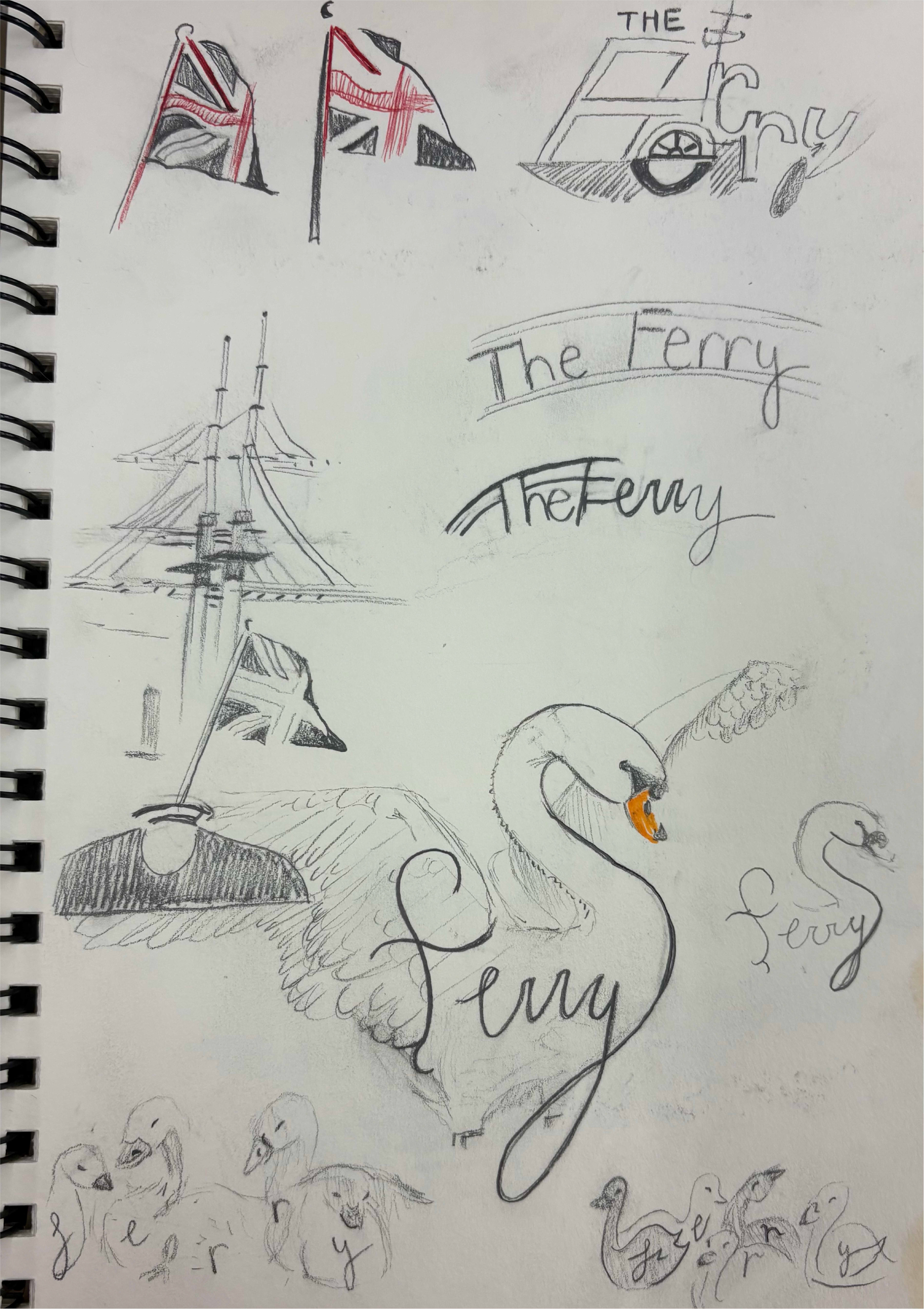
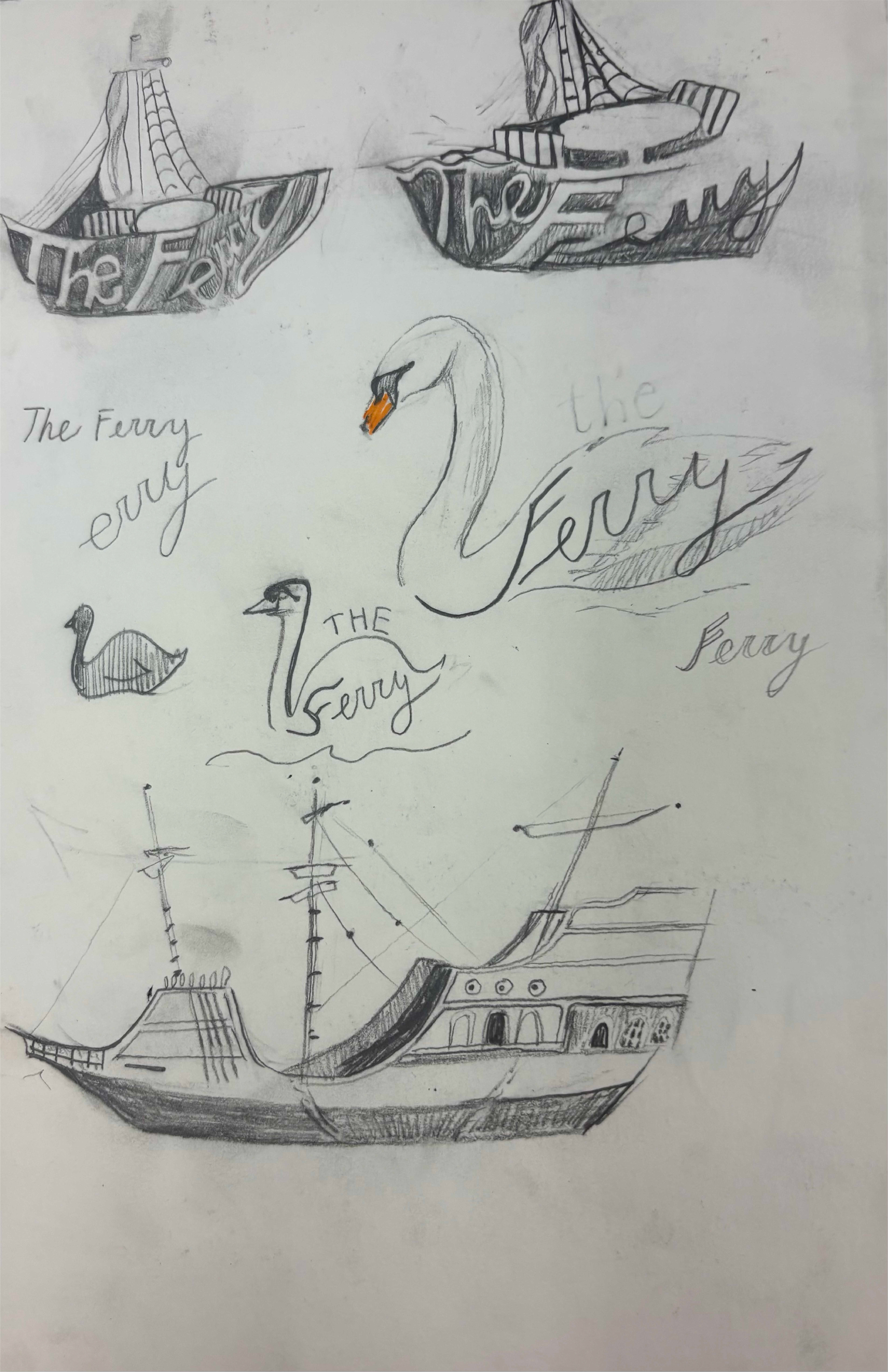
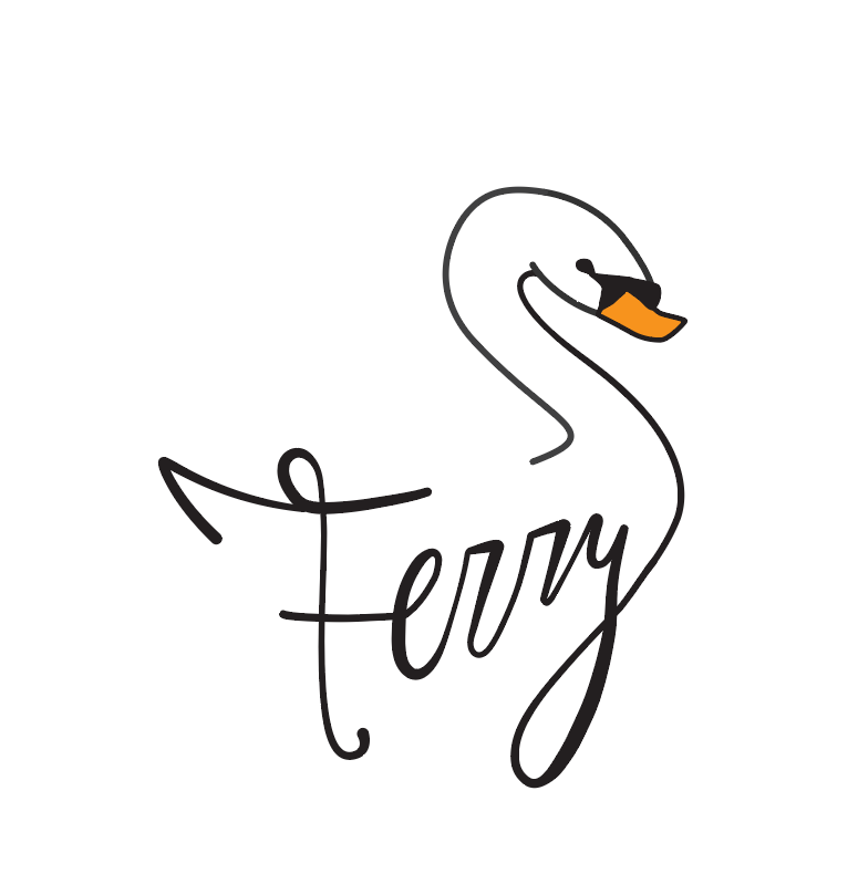
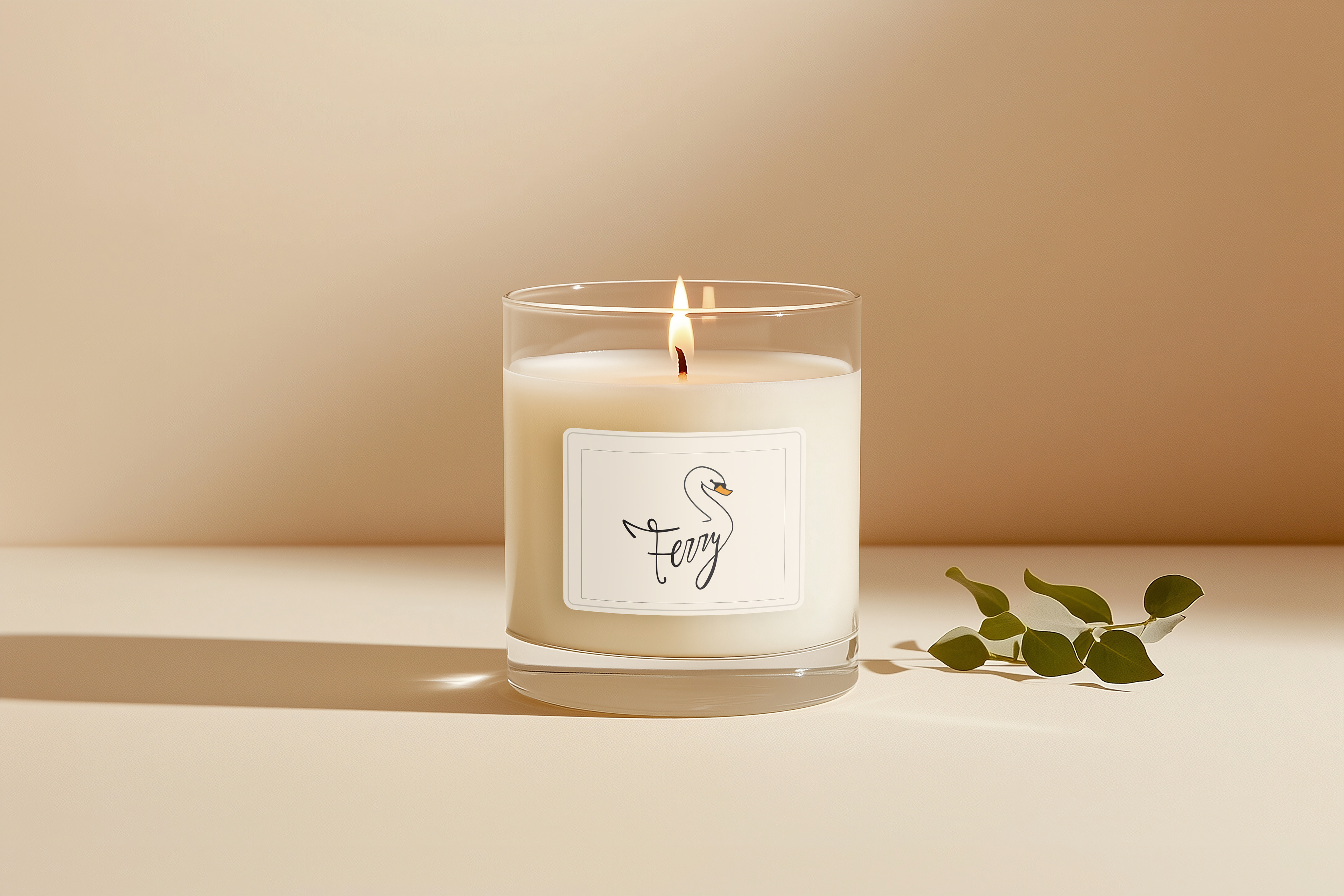
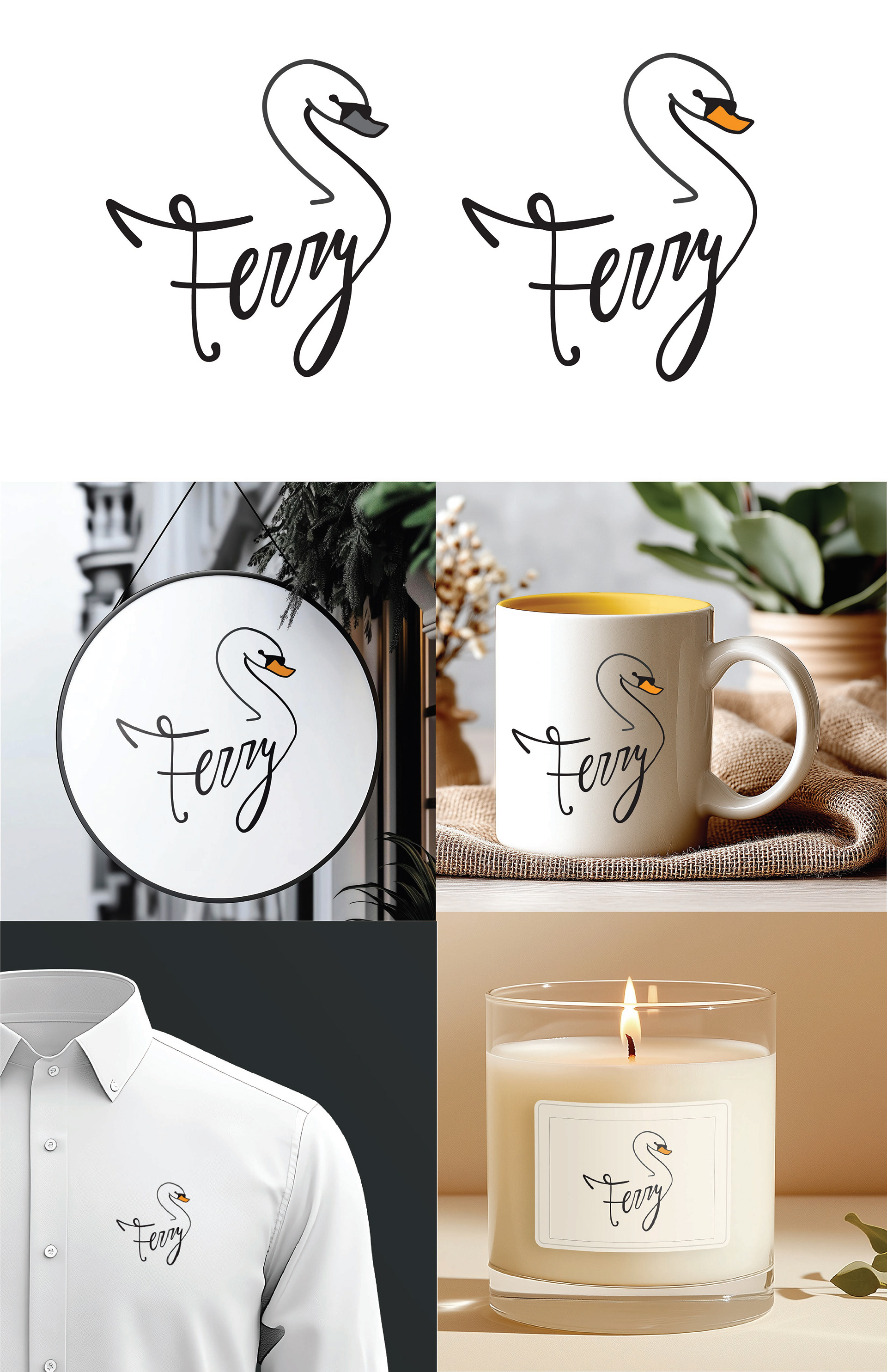
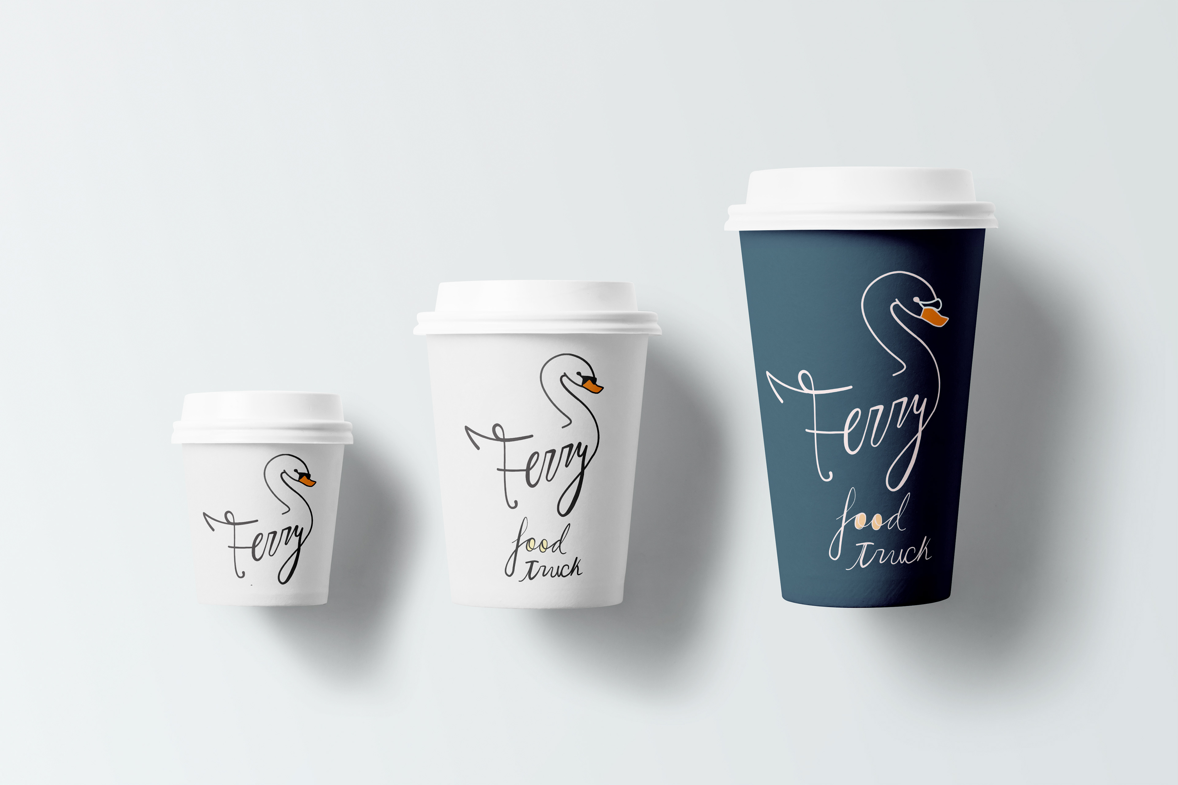
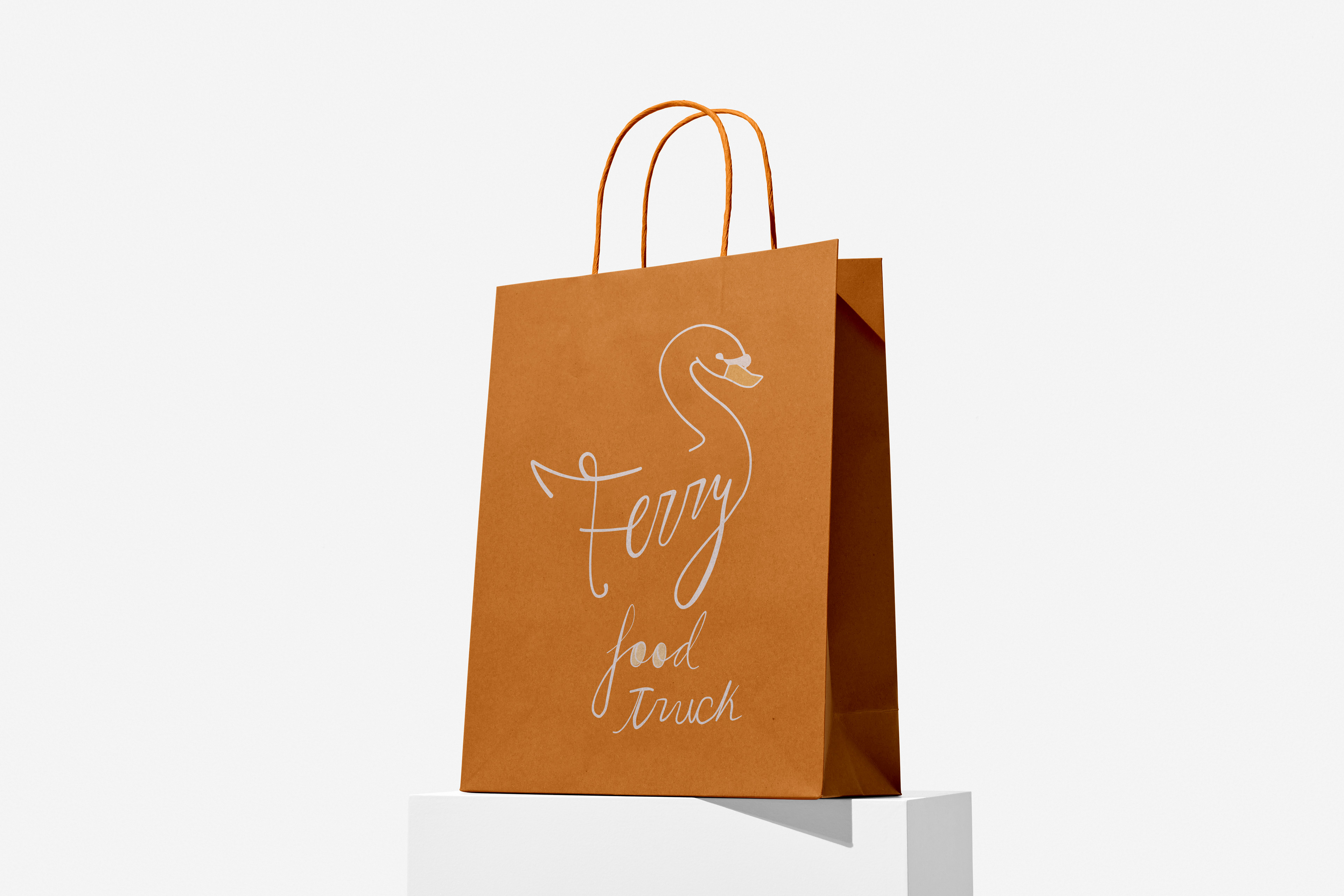
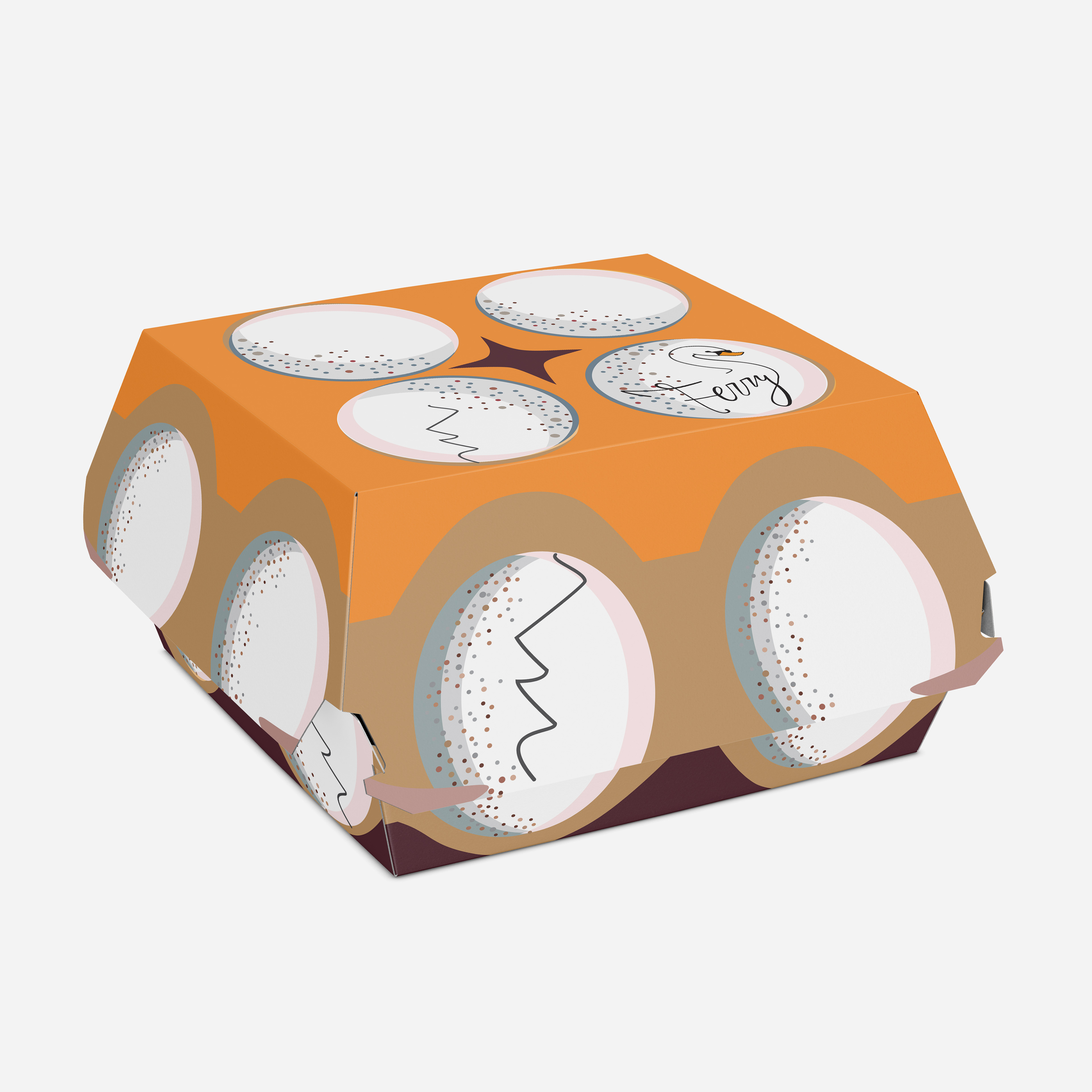
This is a mascot logo type I designed for a restaurant my family visits in Cookham, England. I chose a British establishment because my family is from there and I appreciate the unique differences they have. To mimic the swans that can be seen in the river Thames, I used my own cursive script to integrate my design with the animal as a decorative accent. The name “Ferry” was better standing by itself instead of including the full title “The Ferry” in the logo. For packaging I wanted to make the logo a focal point so that the public knows where the food has come from and feel encouraged to go themselves. First, I designed multiple coffee cups in different sizes, larger ones include the subheader in the logo for a food truck. My idea is original because fine dining food trucks are a rare commodity. Then I add the logo to a beige shopping bag with an orange tone to match the beak of the swan. Paper bags are inexpensive and convenient for taking away food. I came up with a concept for a hamburger box that could carry a main meal while looking like an egg carton. My goal for this restaurant is to convey an elevated fine dining experience with cheerful illustration.
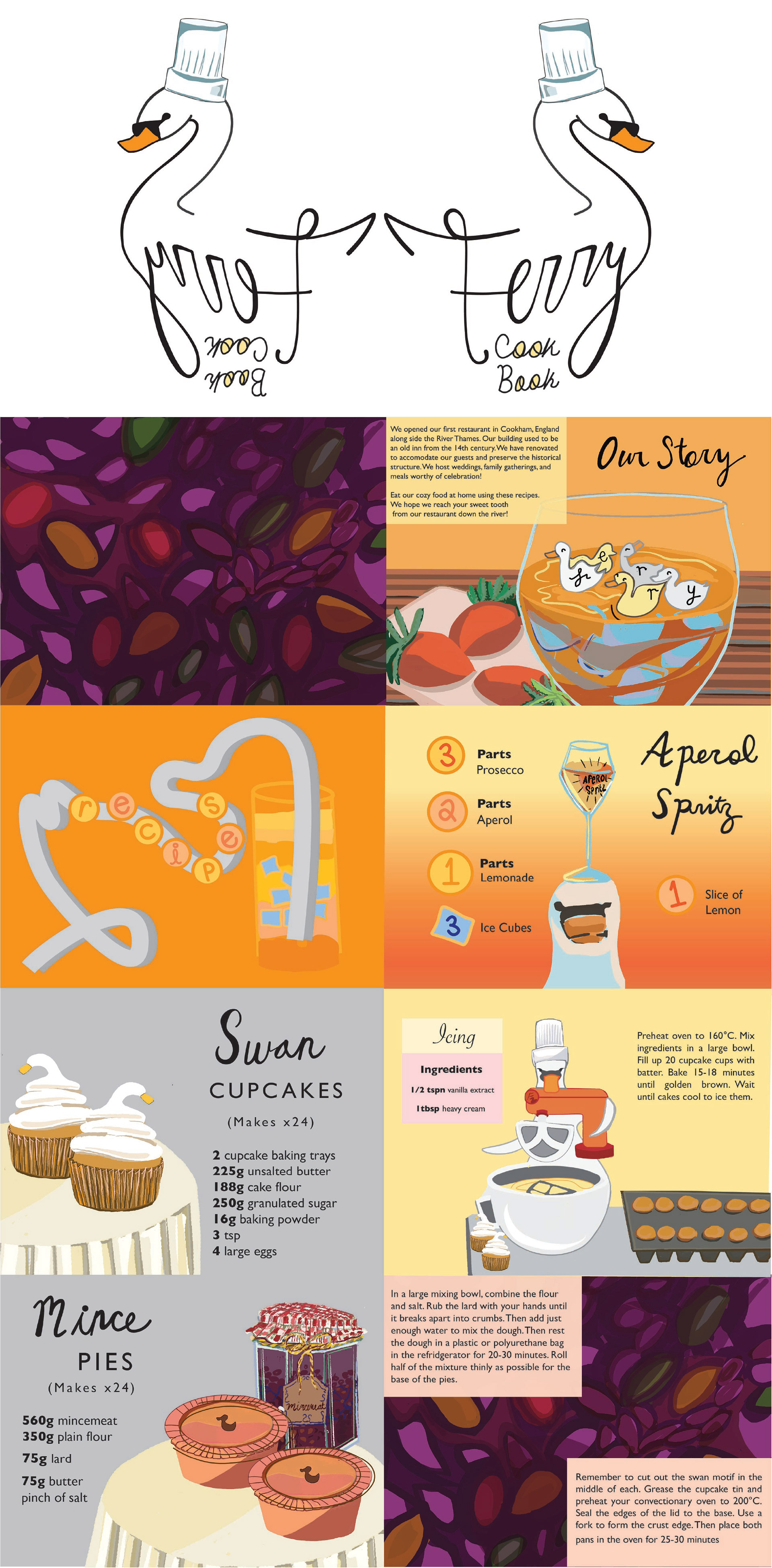
For the cookbook cover, the logo makes up a majority of the composition, with the inclusion of a chef's hat on the swan. The back cover is an inversion of the front cover, which is an original interpretation for a branded physical book. After a closer look, you can see that I made the ‘o’s’ in ‘food’ and ‘cook book’ look like eggs to match the swan theme. I made an initial layout to plan how my illustrations will pair with the recipes I wanted to use. The measurements are according to the metric system to be fully authentic for a classic English-style instruction model. First, I made a drawing of what an ideal mince pie would look like on the inside with purple currants. In the beginning is the story of the Ferry because the building is actually from the fourteenth century. Historical places should be commemorated with designs that are dedicated to them, instead of relying on a reconstruction of the building itself.
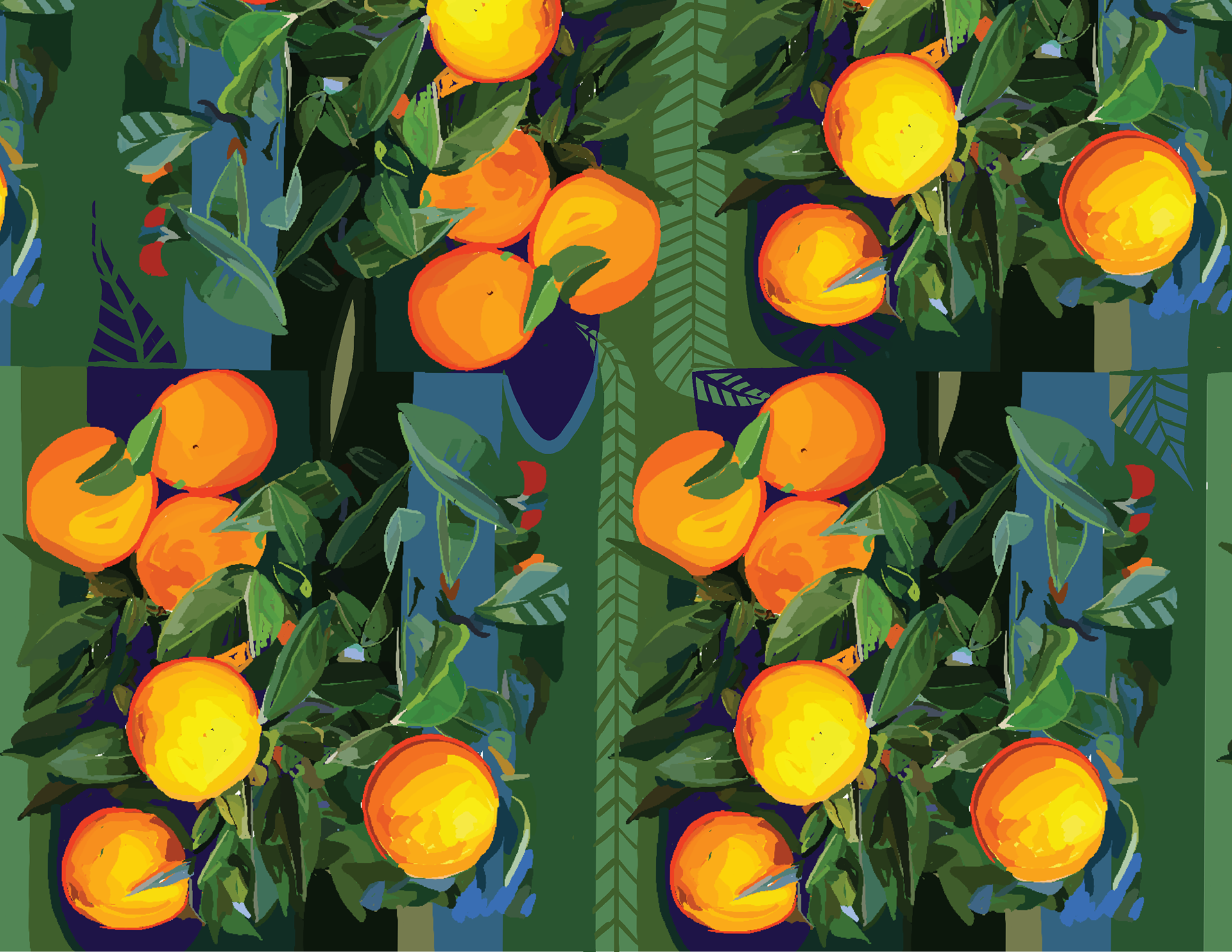
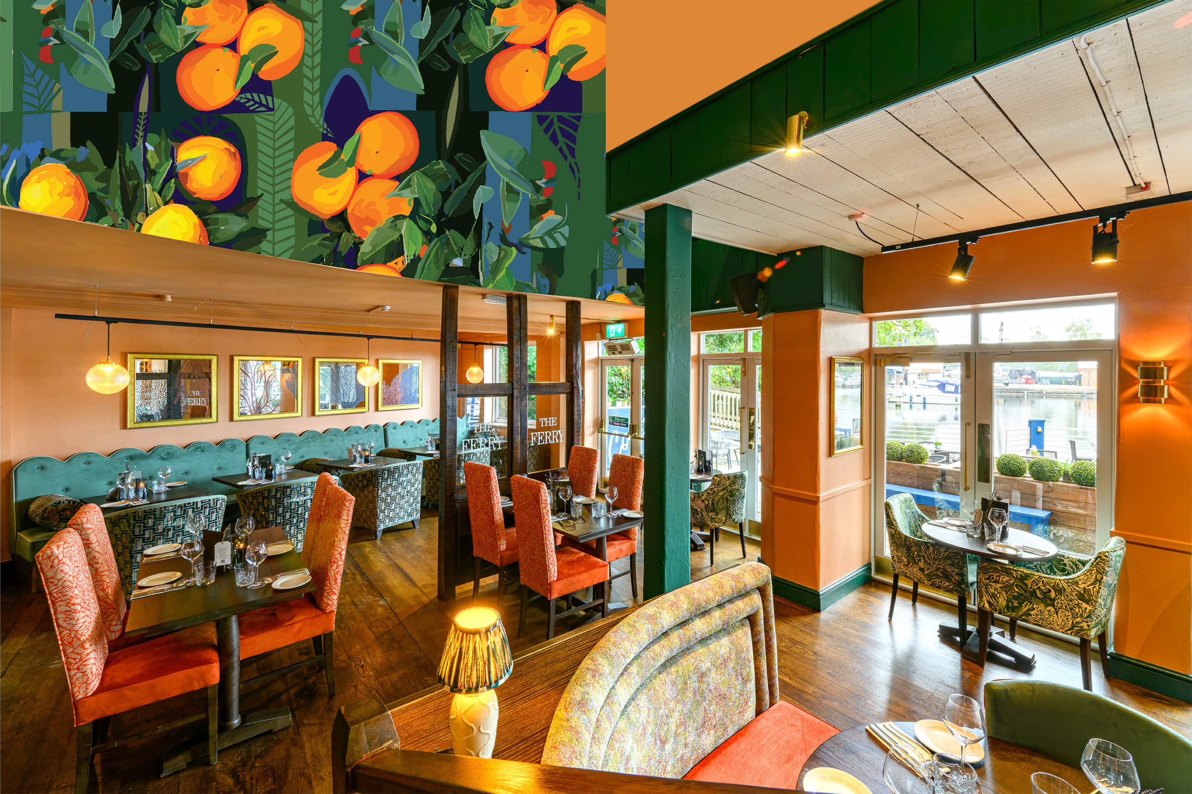
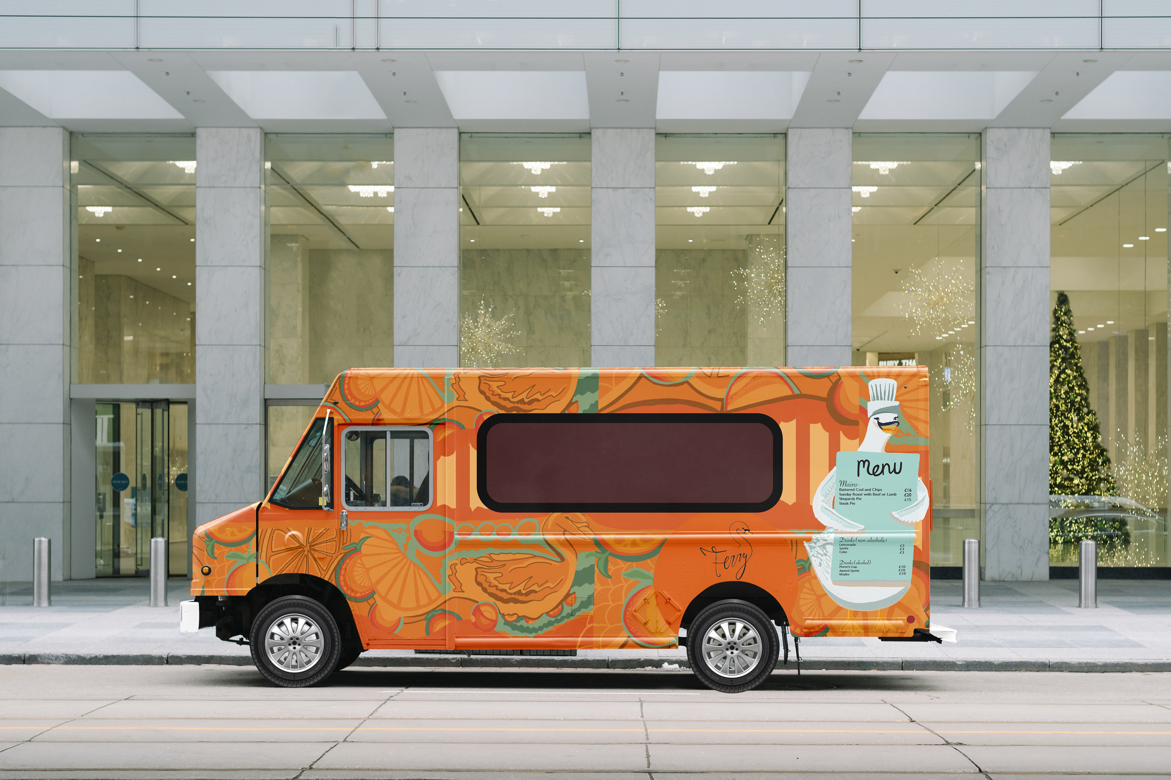
This final compilation is of all the branding I made for The Ferry restaurant including the logo, mockups, packaging, an interior wall design for the inside of the building, and food truck designs.